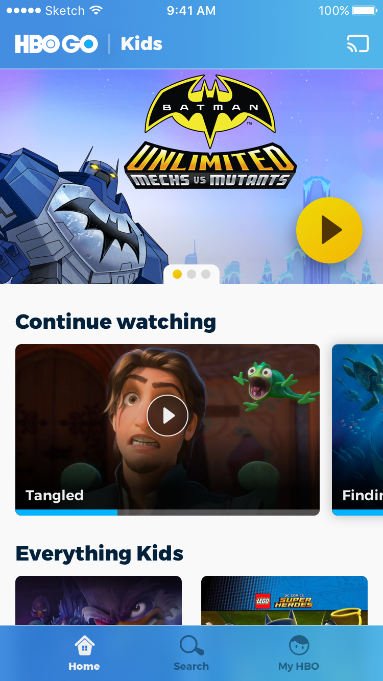
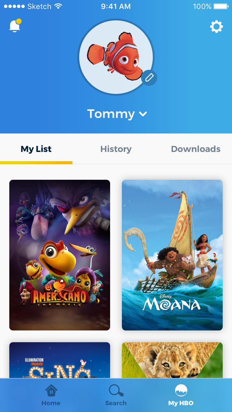
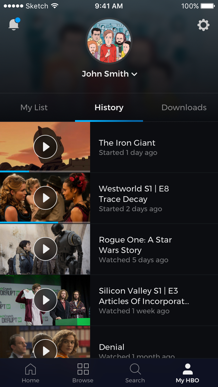
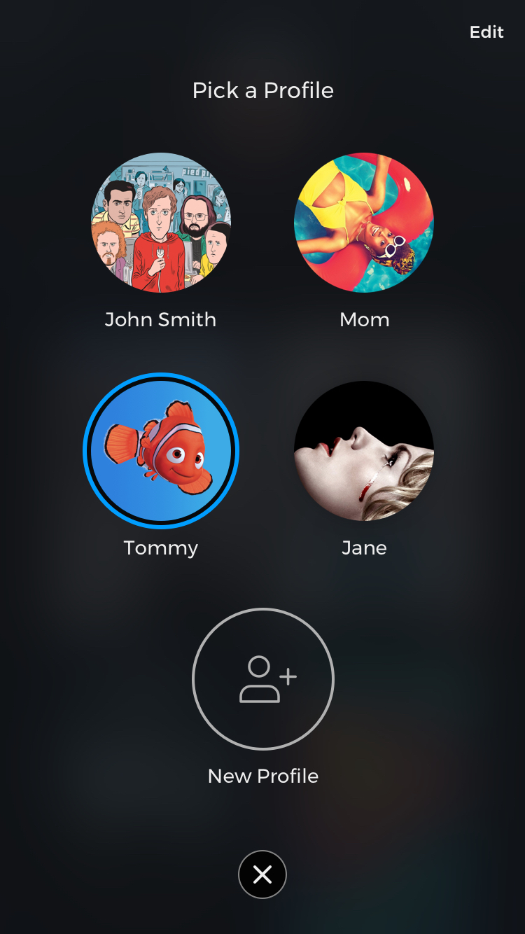
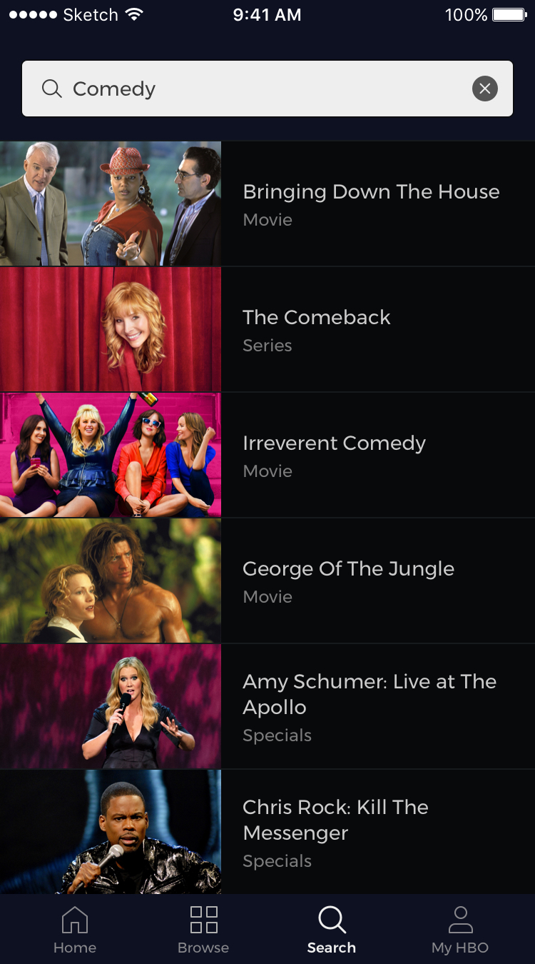
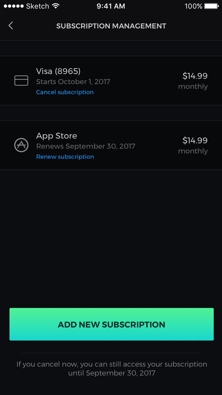
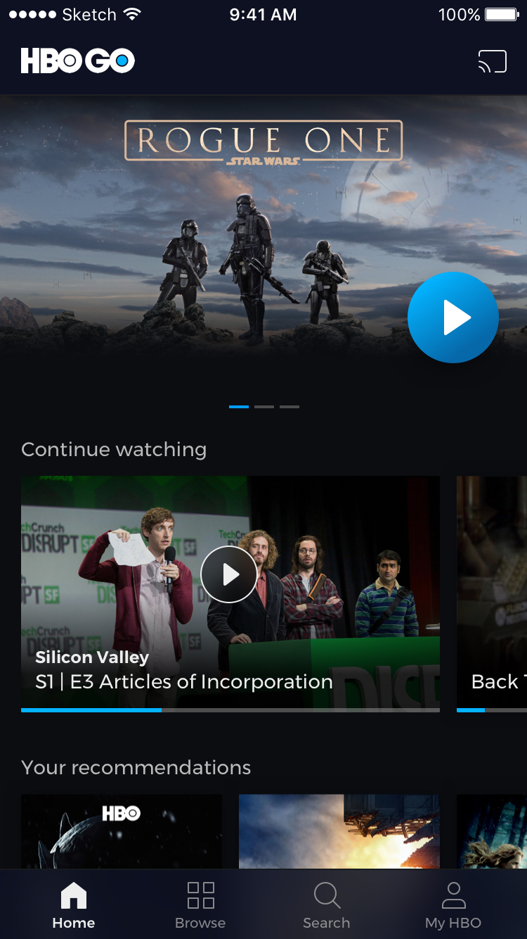
It was completely redesigned to enhance user experience and discovery.

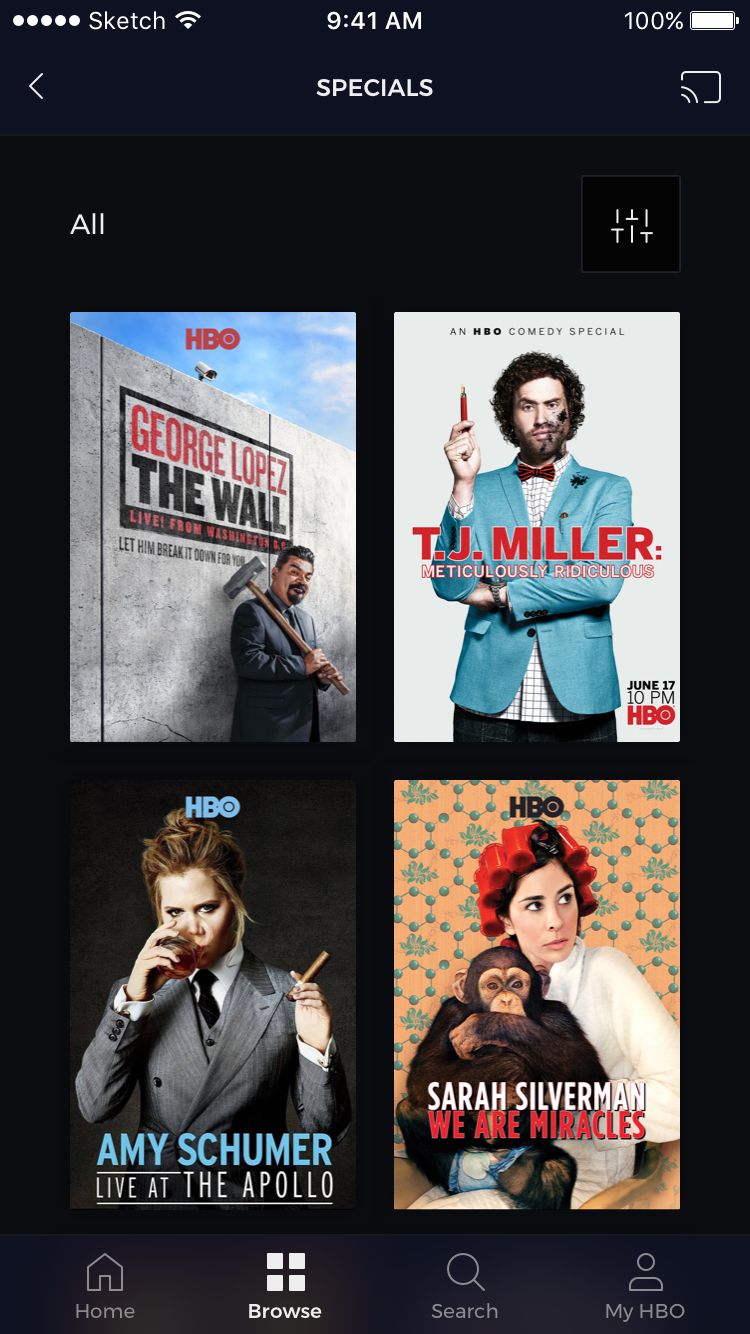
The main focus of this project was to implement new features like Payment Method & Registration, Profiles customization & Management, Intuitive Browsing Experience, Optimized Search Features, Kids Dedicated Profile, and Player Controls & Programming Guide.

My role as the Lead UI/UX Designer was to make sure we were able to achieve new features by providing competitive research, manage deadlines, and following business requirements. We defined the final look and feel and was able to re-design the whole experience into a new and intuitive flow.
Color Optimization

Color is arguably the second most crucial aspect of an app after functionality. The human to computer interaction is heavily based on interacting with graphical UI elements, and color plays a critical role in this interaction. It helps users see and interpret the app’s content, interact with the right elements, and understand actions.

HBO GO Blue

#009DFF

Dark Accent Blue

#080C1D

Dark Background

#0B0D11

Typography

Optimizing typography is optimizing readability, accessibility, usability, and overall graphic balance. We carefully picked a font that was optimized for the web, but that would also keep the HBO GO brand look and feel.

Montserrat Regular

A B C D E F G H I J K L M N O P Q R S T U V W X Y Z

a b c d e f g h i j k l m n o p q r s t u v w x y z

Montserrat Medium

A B C D E F G H I J K L M N O P Q R S T U V W X Y Z

a b c d e f g h i j k l m n o p q r s t u v w x y z

What we delivered

After five months of work and research, we were finally able to deliver a complete mobile application experience for HBO GO. To prove our hypothesis to other teams, we are in the process of A/B testing the onboarding flow and other features using Applause